On this page
The panel of an activity from the watch shows how the session went: lap by lap, over time and across intensity zones.
CalendarClick an activity in the calendar. The Laps, Charts and Map tabs appear only when the watch recorded that data; an activity entered by hand has just the Overview.
Zones
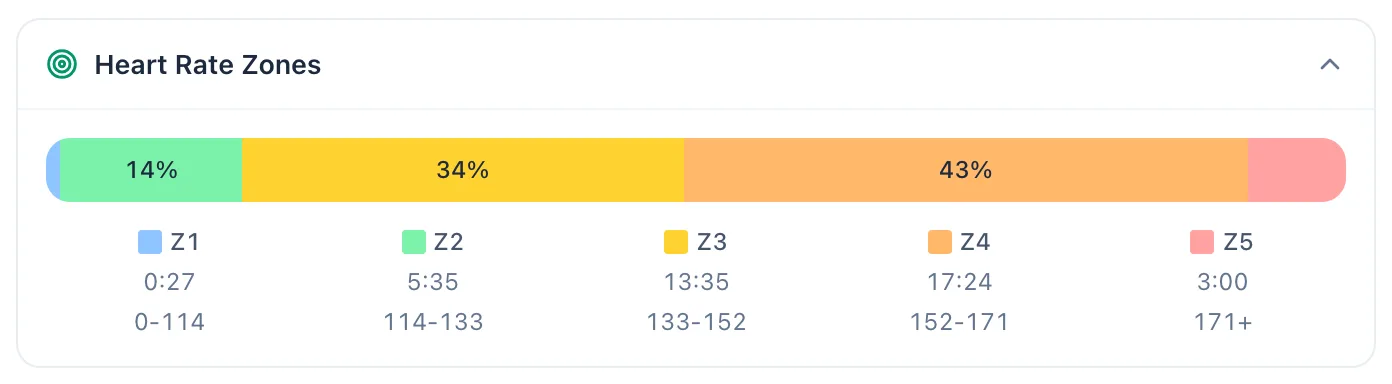
On the Overview tab, below the metrics, the Heart Rate Zones section shows each zone's share of the session, the time spent in it and its heart rate range. Rides with a power meter also get a Power Zones section.
Laps
Read the table
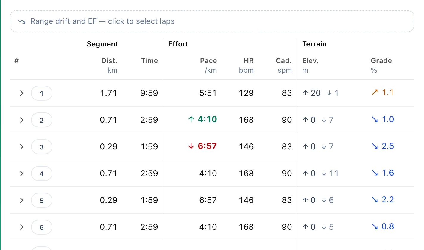
Each row is a lap or split from the watch: distance, time, pace or speed, heart rate and terrain. An up arrow marks the fastest and a down arrow the slowest lap among those shown. The arrow at the start of a row expands the lap details.
Measure a range
Click Range drift and EF — click to select laps, then the first and last lap of the range. Below the table you get the time, average pace, EF and heart rate drift for the selection. Finish leaves the selection mode.
Charts
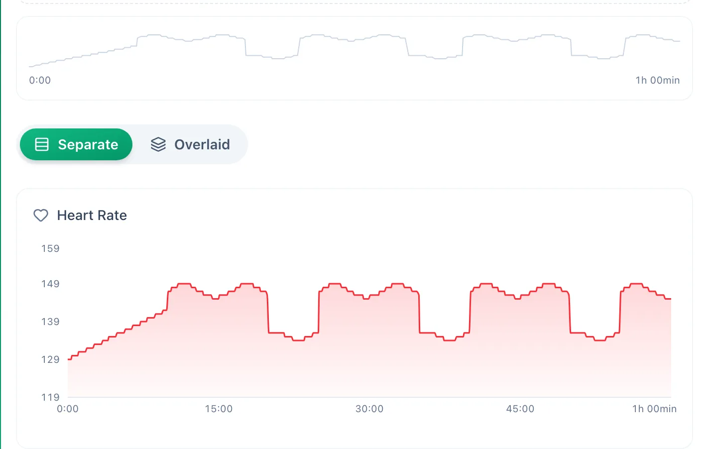
The Charts tab plots heart rate, pace or speed, power and elevation over time. The Separate and Overlaid switch stacks them or puts them on one chart. Dragging across the strip above the charts selects a range and computes the same values as a lap selection.
More in this section: Analysis
For coaches
Trainer dashboardWhat the trainer dashboard shows: team numbers, athletes who need attention, the weekly summary, upcoming workouts and competitions, and recent activities.For athletes
Athlete dashboardWhat the athlete dashboard shows: today's workouts, 7- and 30-day numbers, the weekly summary, your workout streak, recent activities and the plan ahead.For coaches and athletes
StatisticsHow to pick the athlete, sport and date range in statistics, and what the Overview, Training, Progress and Wellbeing tabs contain.For coaches and athletes
Training load and formWhere training load from power, pace, heart rate or RPE comes from, which athlete thresholds it needs, and how to read the load chart and the form chart.For athletes
ReportsHow to submit a report your trainer asked for, read the trainer's reply and correct your own answer after submitting.